Wednesday, April 28, 2010

The International Typographic style

The 1950's graphic style, "The International Typographic style", originated in Switzerland and is also known as the "Swiss" style. It's known characteristics were:


  • Based on pure geometry
  • Refined style
  • Cleanliness in style
  • Objectivity
  • Clear communication
  • Functional typography
This was often used in asymmetric layouts, San Serif typeface distinguished the very designs of modernism.
The Swiss movement originated and grew out of Bauhaus and the New Typography movements, in which had similar characteristics as well.
Richard Paul Lohse, used this style in his overlay magazines which featured the Bauhaus architectural design elements. Helmut Schmid, also another designer did a remake of Die Neue Gesellschaft and was well known for the use of the International typographic style.


http://www.aisleone.net/categories/international-typographic-style/

Designers who came out of post modernism were strongly against the Swiss modernism and style, based on the slick and clean characteristics.


Wednesday, March 24, 2010

Marshall McLuhan


C
anadian born Marshall McLuhan became the very heart of media ecology. Being a professor of literature, communications theorist , a literally critic and also an educator, scholar and a philosopher.

Becoming one of the most highly influential man in media discourse but focused on communications.

Being an expert on media culture, he thought that through the way communication is shown, affects how strongly the messages are conveyed.

McLuhan argued that technology is an extension of the human nervous system and that technological changes create new environments of sense and feeling altering gradually patterns of perception. The form of medium shapes its content.

"The new electronic interdependence recreates the world in the image of a global village." (from The Medium is the Message)

He died from a stroke in 1980.


Punch Magazines


punch.co.uk

Week 5

American Kitsch in the 50's


American Kitsch (meaning decreative crap) was around in the 50's and was quite popular and influential.

James Dean was one of the most influential men in that period due to his unique style. The DC-3 plane was another important influence back then. Transports such as buses and cars began to take on the same design as the DC-3.


In the 50's, a lot of the cinemas played science-fiction movies and exterior building designs like Las Vegas contained these same use of curves seen in sci-fi genres(spaceships).


The 50's designs usually contained casual script but the object designs turned from Bauhaus, sharp and rigid to curvy. Telephones had organic curves. The kidney shape artist palate was also used as coffee tables and were seen everywhere in the 50's. Stacked chairs were designed for function but its sexy, sensual appearance shaped typical, popular furnitures in the 50's. The electric guitar was made in that organic shape to look sexy and sensual. Furniture's such as the duke box contained aerodynamic shapes and lines.

It was heading towards abstraction.


Theatre ad entertainment posters liked to exaggerate and often used cartoons. Parody was a characteristic at that time and Victorian banners were used sometimes in photos.


Pop art started around this time. Andy Warhol, one of the most well known Pop artist used a lot of cartoon characters. Detective novels used exaggerated expressions and poses. Cartoons were often used on logos, while disembodied heads were seen on posters and packaging. The poster for the movie, "Casablanca", contained this. This characteristic wouldn't be included in history books but it is quite important to graphic designers as this has been quite an influence over the many years for design. The political values of these cartoons were to exercise the freedom of speech.


Science became a new thing in advertisement. e.g.. band aids


Life was more easier to understand back then. It appeared more innocent and simpler.


Wednesday, March 17, 2010

Week 4

John Heartfield


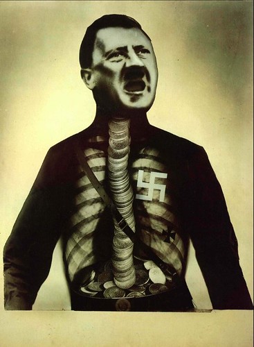
Berlin artist John Heartfield, also known as Helmut Herzfelde is best known for his photomontages as well as being a designer, painter and journalist.
John has influenced many other Dada artists to create their own series of photomontages around the world.
As an anti-Nazi German he created photomontages to make political statements and to convey the message of the corrupted Nazis and government in
germany during the World War II.

His goal was to undermine the propaganda that was growing in Germany and the rising of
communist nationalism. This was shown through his works and used in a Satire form through the images of Adolf Hitler and Swastika.


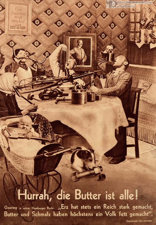
One of his well known pieces, "Hurrah, Die Butter ist Alle", was made in 1935 and translates to hurray, the butter is gone. It consists of a family dining together and the attempt to eat with difficulty pieces of metal. In the background there is a large portrait of Adolf Hitler and Swastika wallpaper. During the period, propaganda was very influ
ential to the society, so basing his on those similar posters, John Heartfield created irony and strong imagery through his works to convey the message to the public.

Week 3


Timeline of Movement and Eras


Scientific Revolution - 17th century

Modern - 18th century

Neo Classism - 19th century

Industrial Revolution - 20th century


Modernism is based on social and cultural events mad began in

colonial American in the 18th century.Early modern refers to several movements:

  • New typography
  • Bauhaus
  • Constructivsm
  • Dada (means nonsense and ready mades)
  • Futurism

And the one thing they had in common was experimentation.


Though the number of middle class, they created another revolution, "The Philosophical Revolution" and during that time "The Enlightment" began and Napolean began to build an empire. During 1815, he was removed from having p

ower and by the 19th century, art marked a new movement, Neo Classism. Neo classims meant new classism and by the 1960's it became a war cry. It again came our 400 years later. After that, in the 20th century, the era of Industrial Revolution began.


The Industrial Revolution followed the scientific Revolution. During this movement, middle class was born out of it and they were able to arise above the peasant class. This business went unchecked until James Morris.The middle class had social and political power.


Ziegest (something important in time) went to Germany and out came the Bauhaus. Bauhaus was essentially about rules for design meaning less was more. The Bauhaus was a very big school and through this Constructivism emerged. Constructivsm was Russian based and used Bauhaus for political reasons. Propaganda. Russian constructivist absorbed Cubism and Futurism to crest a new movement which unifies communists ideology with visual form.

Minimalism also came from Bauhaus as it was about reducing things to its simplest form.


Markism came in and replaced Feudalism and was the first social theory based on Capitalism.


What is the difference between contemporary and modern?

Comtemporary means now and will continue whereas modern refers to the period that follows the modern revolution.


Cubist art had a major effect on graphic design, including Exspressionist posters of Germany.

In 1962, one form of propaganda was created by Plaskatil artist who used distinctive and eye catching colours.

Futurism became a huge influence on other art movement as its violent, revolutionary techniques were adopted by Dadaist, Constructivitis, De Stijl, Duchamp and Tzara.


Week 2


Arts and Crafts


The arts and crafts (aesthetics) movement was of the modern movement and the victorian movement. This group supported artist, architects, writers etc..

Made of the socialist reform group, they would often make theories on how people should run their lives.


One well known, Arts and Crafts artist, was William Morace. William Morace was known to fight against ugliness in all its form and influenced artists and works, in the Arts and Crafts movement. Till today you can still witness this form having a huge influence in the many everyday objects you see today.

His own house was heavily influenced by the medieval scheme on the exterior but appeared to be more of warmth in the interior and using the basics of the Arts and Crafts appearance.

Arts and Crafts are created with very distinctive characteristics, with the use of:

  • Organic shapes
  • Unity
  • Patterns work and fit together to create unity
  • Truth to the materialism e.g.. Not painting on wood and leaving it to its true form
  • Less excessive
  • Some of the works are based on oriental designs


William Morace loved using natural elements with things such as woods, figs and neutral texture. The Victorian era influenced him in his textile works and forms.


"Form follows function" - William Morace


Morace is one of the most influential architects in the world now.

Typography: Goudy and Caxton was brought in by William Morace as well as having made 21 manuscripts by him.

Another very influential artist that was well known in the Arts and Crafts movement was Frank Floyd.Frank was known more for being modern.


Art Nouveau (meaning new art in French)


Art Nouveau started around the 1880 and was a direct descendant from the Arts and Crafts movement. This new movement stood for feminine beauty and rebelled against the Victorian style.

Make up and feminine beauty products would often refer to Art Nouveau as it was "glamourous and enhanced beauty". This new movement became big and was associated to Paris but not long after, Art Nouveau became international and was influenced everywhere. In Paris, buildings had a lot of slurping roofs before the flat to bring more light in. Van Gogh was another huge influence to the movement Art Nouveau.


The distinctive Art Nouveau characteristics that make it so well known are:

  • More Feminine
  • Less restraint - not too over done, more simple
  • Energetic and unstable
  • Couldn't just be decorative but also functional
  • Angles, structure and curves had a purpose - to strengthen and enhance function of the material
  • Diagonal dynamic
  • Assymmetrical dynamic
  • Organic
  • Abstract shapes and flat colours
  • Was influenced by japanese wood block
  • Gives unity and guides eyes around the poster
  • Repeated shapes (organic and diagonal)
  • Sensuous outlines and curves
  • Abstract
  • Main poster girl often looked like the same girl - same curves, features, hair etc..
  • Freerer organic lines that Arts and Crafts.


    As Art Nouveau became hugely influential internationally, you can see these characteristics everywhere and even till today.


Tuesday, March 2, 2010

Week 1

The Industrial Revolution


What was the Industrial Revolution

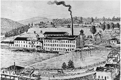
The industrial revolution was the beginning of an era that changed society and the introduction of mass production. In England, before the revolution began, life was filled with farming and rural lifestyles. Education was hard to come by. People worked hard in what they did and the environment remained green and beautiful. This was before the introduction of machinary but as soon as this came in place, England became a more polluted environment. T

he cities filled with smog and filth from the large amounts of coal used in the factories created pollution. The industrial revolution brought many improvements to the marketing industry. Things were produced faster as things that were all done once by hand were now done by machines, making the speed rate of producing more quicker and efficient. This then spread through out Europe not long after.


What affects did it have for us designers


The industrial revolution made a huge impact and has helped designers most ardently in the mass production as things became easier for them. Machinery was used to print and produce designs, advertisement, labels, logos and many other things relevant to designers. Single handed paints and prints were made easier as machines helped; taking the burden or hard labour. Another postitive affect that designers could appreciate, was how they were able to go back and edit what they had originally created rather than starting over. There was a higher demand for production posters which led to the first advertisement.

What was the moral/philosophical/religion climate of the time
During the industrial revolution, society held rather rigid, conservative morals and values. It was morally right not to show skin but because sex sells, just the idea of showing a little bit of skin on the ankle was highly controversial but it helped advertisement a lot.

What was the characteristics of the Victorian time

Characteristics of the victorian time were the
use of :
  • Many different fonts
  • Symmetry
  • Packed together
  • Intricate borders
  • Cluttered and busy
  • Use of cloth banners
  • Nostalgic and sentimental
  • In books, intricate drop caps were used
  • Not a lot of hierarchy (victorian fonts)